
Before & After : OPI Avijuice
Before & After : OPI Avijuice

 There’s nothing like a lotion that smells almost good enough to eat. The Avojuice line from OPI features ten different fragrances, including coconut melon, mango, jasmine, and vanilla lavender, to name a few. Yolanda Petriz Jordan redesigned the packaging for the line of hand and body lotions, which come in three different bottle sizes.
“I decided on a color-coded, pattern system taking a cue from the new fragrance profiles, which are cleaner, sharper, and fresher than the original. The fun, vibrant patterns give the bottles a fresh, modern look without sacrificing the professional equity the OPI brand is known for. The Avojuice line features a sleek new bottle and bold graphic labels.”

สรุปการแปลจากเนื้อหา
ก่อน&หลัง : การพัฒนารูปแบบของ OPI Avijuice
มันไม่เหมือนกับโลชั่นเพราะมันมีกลิ่นที่เหมือนกับว่าสามารถกินได้ภายใต้ชื่อ Avojuice จากแบรน์ OPI
ที่ออกมาต่างๆกันทั้งหมด 10กลิ่น มีน้ำหอม มะพร้าว แตงโม มะม่วง มะลิ และ ลาเวนเดอร์วานิลลา Yolanda Petriz Jordan ได้ออกแบบบรรจุภัณฑ์โลชั่นสำหรับทามือและร่างกายชึ่งมาในรูปแบบที่มีความชัดเจนมากขึ้น โดยมาในรูปขวดที่แตกต่างกัน 3ขนาด "ผมตัดสินใจออกแบบให้มีรูปแบบโปร์ไฟล์ที่ชัดเจนมากขึ้น ในรูปของสีสันและกลิ่นที่บ่งบอกถึงความสะอาดสดชื่นและสนุกกลับรูปแบบสีสันของขวดที่ดูทันสมัย ภายใต้แบรนด์ระดับมืออาชีพ มีอักษร OPT ที่เป็นตัวหนา และมีคำAvojuiceใต้บรรทัด มีขวดใหม่ที่เพรียวบาง และป้ายกราฟฟิกที่บอกความชัดเจนมากขึ้น

Tai Yan Yu Sea Salt is a product of Kinmen, a small archipelago of several islands, governed by Taiwan. It's an island whose main industry is tourism and is also known for a number of cultural and specialty food products. Two of the specialties hailing from Kinmen are the local sea salt and seaweed. And, with a tourist economy in mind these products needed packaging design that was attractive and giftable for travelers to take back to the mainland with them.
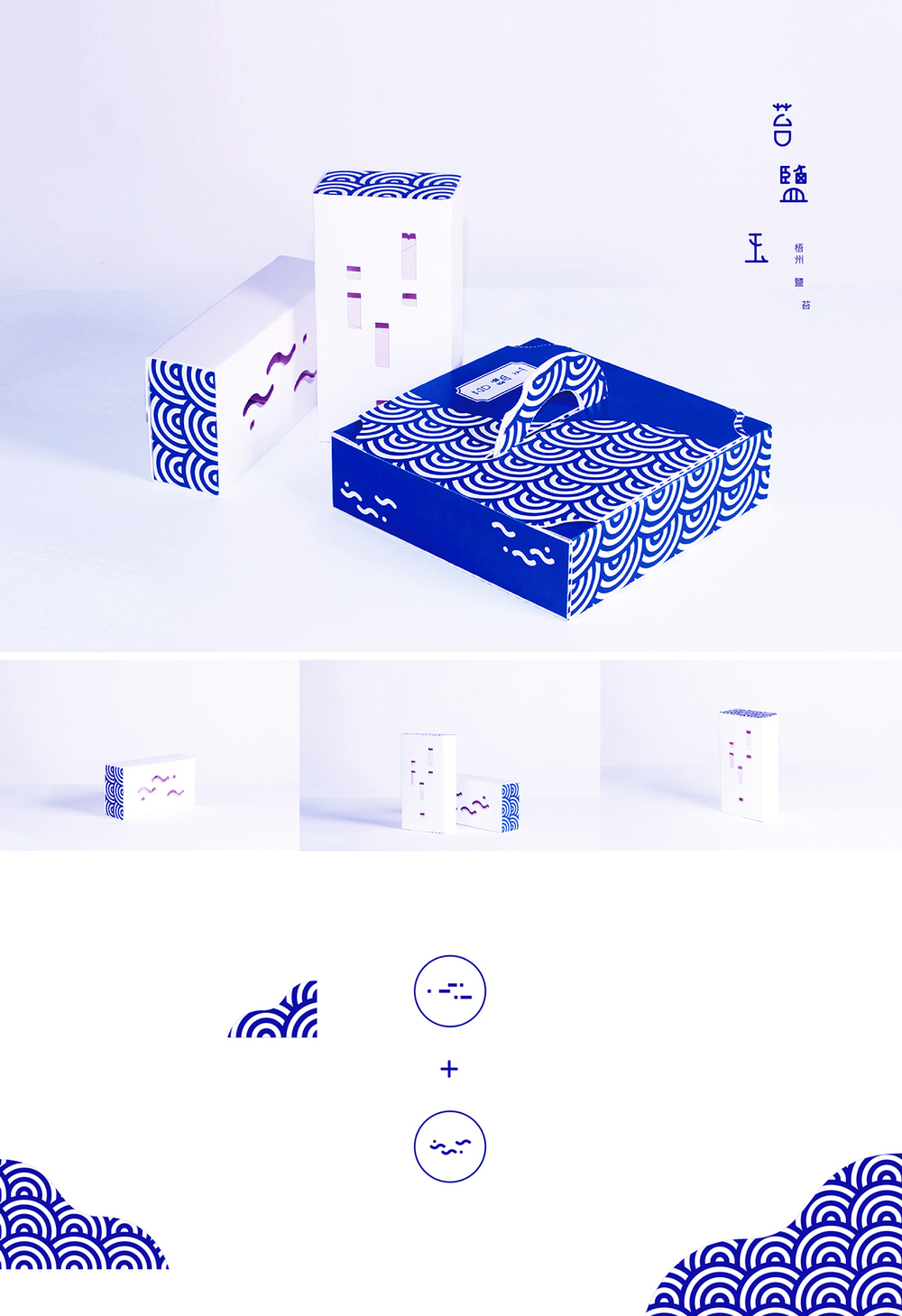
The designer for this project, Chen Wu, calls Kinmen his hometown and wanted to create a design that would promote the characteristics of the island. Wu chose to work with a simple, beautiful blue and white color palette for all elements of the products packaging. These colors are symbolic of the clean island air, which is a sharp contrast to the pollution of mainland Taiwan.
Wu created a simple wave pattern to use as the dominant art direction throughout all pieces of the Tai Yan Yu Sea Salt packaging. The wave being emblematic of the ocean which surrounds Kinmen and from which the products are harvested. There is also an abstract sea salt and seaweed symbol that Wu has incorporated intermittently throughout the packages.
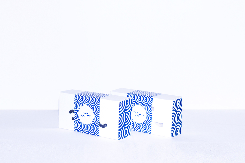
There are two sizes of packaging for the Tai Yan Yu Sea Salt, with the shape and design being significantly different from one another. The small product packages are mostly white,
with a belly band covered in the wave pattern slipped over the center of the box. In my opinion, a belly band can really be a nice touch, it has the ability to take a simple box and
transform it into a gift.
The larger box is square in shape, shallow in depth and has a circular carry handle which mimics the shape of the wave pattern perfectly. For this design Wu chose to go heavier with the blue color palette, steering away from the light white being used on the other box size.
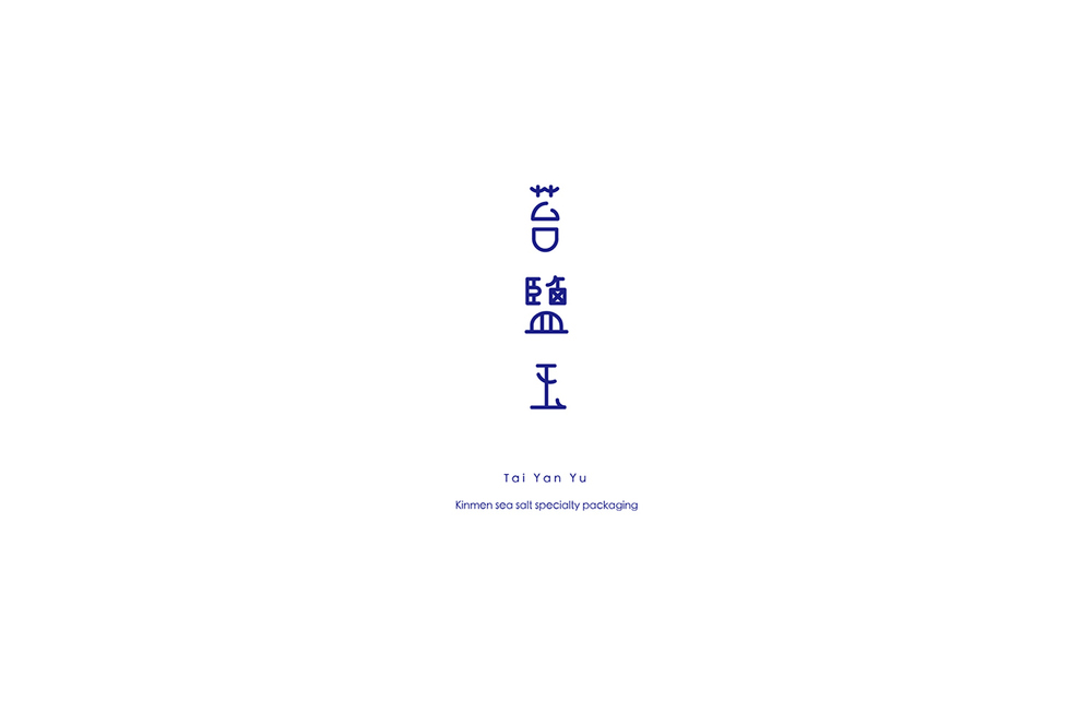
The Tai Yan Yu Sea Salt logo mark is placed on the top of the package, set apart from the patterning so it holds a prominent placement without ornamental distraction.


Designer Chen Wu's goal in creating the Tai Yan Yu Sea Salt packaging was to infuse characteristics of his hometown of Kinmen into the art direction. The clear blue color palette representing clean air, the wave pattern referencing the ocean and the abstract icons of the product itself.

ไทยานยู - จินเหมินทะเลเกลือพิเศษ
ไทยานยูซีเกลือเป็นผลิตภัณฑ์ของจินเหมิน ที่เป็นหมู่เกาะเล็ก ๆ หลายเกาะ ในไต้หวัน เป็นเกาะแห่งการท่องเที่ยว และเป็นที่รู้จักในวัฒนธรรมและผลิตภัณฑ์ ผลิตภัณฑ์ที่มีความเชี่ยวชาญจากจินเหมินคือเกลือและสาหร่าย เป็นอีกเศรษฐกิจนึงทางการท่องเที่ยว ผลิตภัณฑ์เหล่านี้ต้องออกแบบบรรจุภัณฑ์ที่น่าสนใจ และเป็นของฝากสำหรับนักท่องเที่ยวจะกลับแผ่นดินใหญ่ด้วย
การออกแบบสำหรับโครงการนี้ อู๋เฉิน เลือกจินเหมินบ้านเกิดของเขา และต้องการสร้างการออกแบบที่จะส่งเสริมลักษณะของเกาะ เลือกใช้แบบเรียบง่าย สวยงาม ด้วยสีน้ำเงินและขาวสีสำหรับองค์ประกอบทั้งหมดของบรรจุภัณฑ์ สีเหล่านี้เป็นสัญลักษณ์ของอากาศสะอาดของเกาะ ซึ่งมีความคมชัดและการลดมลพิษของแผ่นดินใหญ่ในไต้หวัน
เค้าสร้างรูปคลื่นอย่างง่าย ๆ เพื่อใช้เป็นทิศทางหลักทางศิลปะโดยรวมของบรรจุภัณฑ์ไทยานยูทะเลเกลือ คลื่นที่เป็นสัญลักษ์ของมหาสมุทรที่ล้อมรอบจินเหมินและผลิตภัณฑ์ นอกจากนี้ยังมีอัตลักษณ์ของทะเลเกลือและสาหร่ายรวมเป็นระยะ ๆ ตลอดทั้งแพคเกจ
มีสองขนาดของบรรจุภัณฑ์ เป็นบรรจุภัณฑ์ของผลิตภัณฑ์ขนาดเล็กสีขาว กับตัวแท็กรัดกล่องรูปคลื่น ได้สัมผัสที่ดีมีความสามารถในการใช้กล่องอย่างง่าย และแปลงนี้เป็นของขวัญได้อีก
กล่องใหญ่แบบของขวัญเป็นสี่เหลี่ยมในรูปร่าง ตื้นลึก และมีจัดการยกวงกลมซึ่งเลียนแบบรูปร่างของรูปคลื่นอย่างสมบูรณ์แบบ แน่นหนักกับตัวกล่องเป็นสีฟ้า และพวงมาลัยจากสีขาวใช้กับกล่องมีโลโก้ใต้ยานยูซีเกลือ ตั้งอยู่บนแพคเกจ สร้าง patterning ที่เพื่อตำแหน่งที่โดดเด่นได้ดี
BLOOMING CHOCOLATE
การออกแบบโดย:คอนเนอร์ดาวี่
 ]
]


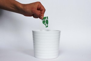 Blooming Chocolate, designed by Connor Davey, brings sustainability into action. A chocolate box that serves two purposes: to store and create. Colorful seed-infused patterns serve as identifiers for flavor testing, and once the dessert is consumed, can be torn into pieces and used to plant that very ingredient.
"A range of different flavor chocolates packaged in biodegradable seed infused card. The mint chocolate pack when planted grows mint, the orange chocolate grows an orange plant, the rose infused chocolate grows roses and the chili chocolate grows a chili plant."
ช็อคโกแลตบลูมมิ่ง
การออกแบบโดย:คอนเนอร์ดาวี่
กล่องช็อคโกแลตที่ทำหน้าที่สองวัตถุประสงค์: การจัดเก็บและสร้าง รูปแบบเมล็ดสีที่มีสีสันทำหน้าที่เป็นตัวบ่งชี้สำหรับการทดสอบรสชาติ และเมื่อขนมทานหมด สามารถฉีกกล่องออกเป็นชิ้น ๆ และนำมาใช้ปักในพืชที่มีส่วนผสมมาก. "ช่วงของช็อคโกแลตรสชาติที่แตกต่างกันบรรจุในเมล็ดย่อยสลายได้บัตรสี. แพ็คช็อคโกแลตสะระแหน่ เมื่อเติบโตปลูกสะระแหน่, ช็อคโกแลตสีส้มเติบโตพืชสีส้ม, ดอกกุหลาบสีช็อคโกแลตเติบโตกุหลาบและช็อคโกแลตที่เติบโตพริกเป็นพืชพริก. "
การออกแบบโดย:คอนเนอร์ดาวี่
]Blooming Chocolate, designed by Connor Davey, brings sustainability into action. A chocolate box that serves two purposes: to store and create. Colorful seed-infused patterns serve as identifiers for flavor testing, and once the dessert is consumed, can be torn into pieces and used to plant that very ingredient.
"A range of different flavor chocolates packaged in biodegradable seed infused card. The mint chocolate pack when planted grows mint, the orange chocolate grows an orange plant, the rose infused chocolate grows roses and the chili chocolate grows a chili plant."
ช็อคโกแลตบลูมมิ่ง
การออกแบบโดย:คอนเนอร์ดาวี่
กล่องช็อคโกแลตที่ทำหน้าที่สองวัตถุประสงค์: การจัดเก็บและสร้าง รูปแบบเมล็ดสีที่มีสีสันทำหน้าที่เป็นตัวบ่งชี้สำหรับการทดสอบรสชาติ และเมื่อขนมทานหมด สามารถฉีกกล่องออกเป็นชิ้น ๆ และนำมาใช้ปักในพืชที่มีส่วนผสมมาก. "ช่วงของช็อคโกแลตรสชาติที่แตกต่างกันบรรจุในเมล็ดย่อยสลายได้บัตรสี. แพ็คช็อคโกแลตสะระแหน่ เมื่อเติบโตปลูกสะระแหน่, ช็อคโกแลตสีส้มเติบโตพืชสีส้ม, ดอกกุหลาบสีช็อคโกแลตเติบโตกุหลาบและช็อคโกแลตที่เติบโตพริกเป็นพืชพริก. "
ไม่มีความคิดเห็น:
แสดงความคิดเห็น